Sunday 16 January 2011


This is a 3 dimensional design of the previous perfume packaging i created, i made this poster as means of corporate advertisement for my perfume product. I researched the current packaging used on aftershaves and perfumes and developed my own design and material.




These are two perfume packaging ideas i have designed, again using the same name "NEMESIS" in the first one it shows what the word nemesis is associated with. And i have tried to create the image that not everything is bad. The second is much more corporate and has an attractive package which will attract customer attention easily.


This is also from the same idea of music advertisement i used in the previous piece of work, this is a poster advertisement which can also be used on portrait bill boards, i have used my own photographed images and thereafter imported them into photoshop to add effects.


Nemesis is a name i thought of to mark my graphics and my design work, i use this name throughtout my design portfolio to keep it fluent and also to create an image of my type of work.
Above is an album cover i designed and photgraphed using objects and pictures to create a strong but simple message.


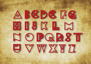
This is the font i created in my first image, i have re-used it and placed onto a canvas and have used effects in photoshop to enhance my work. It is a peace of typography design of the alphabet i created to show and preview what i can achieve with the different text styles.


This image here is a font i created using adobe illustrator, using shapes and tools i drew each letter of the alphabet. And as you can see i have produced an ancient style of shapes and symbols. This font i will then use in my later projects and in my portfolio designs.